-
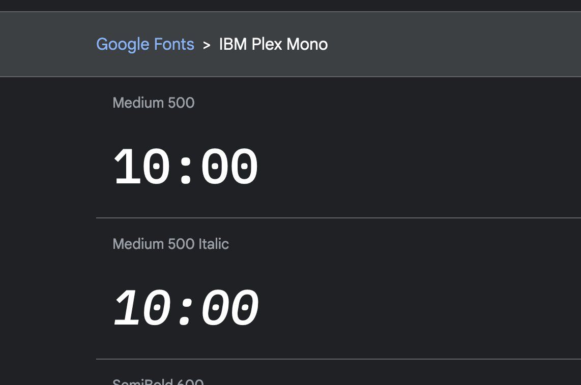
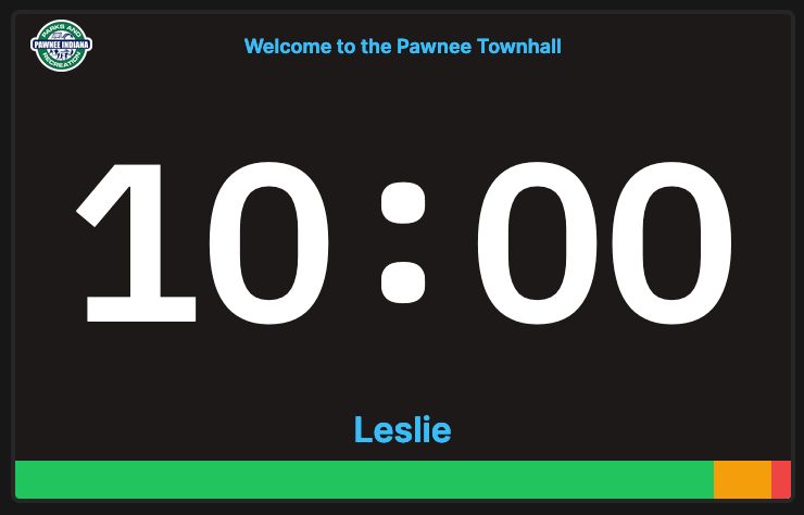
For Stagetimer I used a monospace font called "IBM Plex Mono" But the font comes with this annoying dot in the zero as you can see. So I had to go in and edit the font manually to remove the dot from the zero and slightly raise the colon so it looks good. 😆Permalink On twitter.com
♻️ 1 Retweets ❤️ 17 Favorites Mood +3 🙂
-
A monospace font was necessary otherwise the countdown jumps around all the time. And it's really hard to find one without dot or slash in the middle.On twitter.com
-
Also turns out, colons (:) site low on the baseline to look good with lowercase text. But that looks awful with numbers, so I had to raise it.Permalink On twitter.com